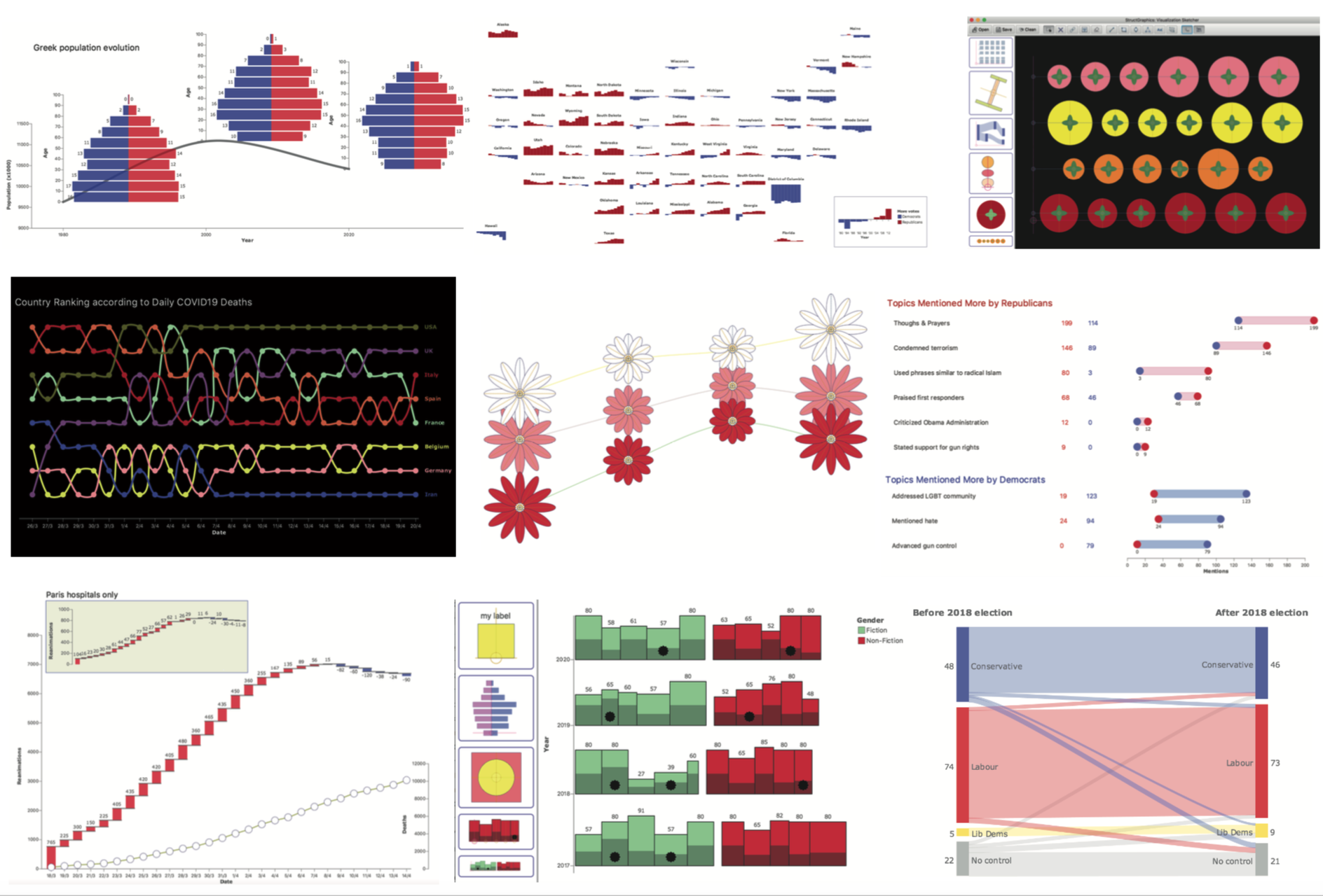
StructGraphics
Theophanis Tsandilas, Université Paris-Saclay, CNRS & Inria
StructGraphics is a user interface for creating data-agnostic and fully reusable designs of data visualizations. The work was presented as full paper at VIS 2020 and appeared at the IEEE Transactions on Visualization and Computer Graphics (TVCG).
Useful Links: [ Paper ] [ VIS Presentation ] [ Code Repository ] [ Study Materials ] [ Tutorial ] [ Bibtex ]
The following gallery of examples demonstrates the expressive power of the approach. We present the original unedited videos, images, as well as JSON specification files. To view a video, hover over an image and then click on the button at its center. Unless explicitely mentioned, the data presented on the graphs are not real.
StructGraphics Overview
A summary video that gives an overview of StructGraphics. It presents and explains several examples, where some of these examples are also presented in the following videos.
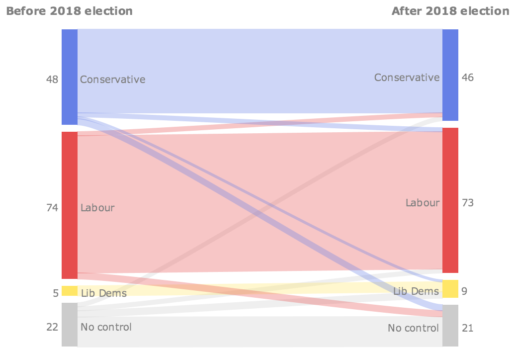
Structured Sankey [real data]
Showing the change in council control after the 2018 local UK elections. It reproduces a Sankey diagram published in the Financial Times.
![[image]](images/sankey-UK-elections.png)
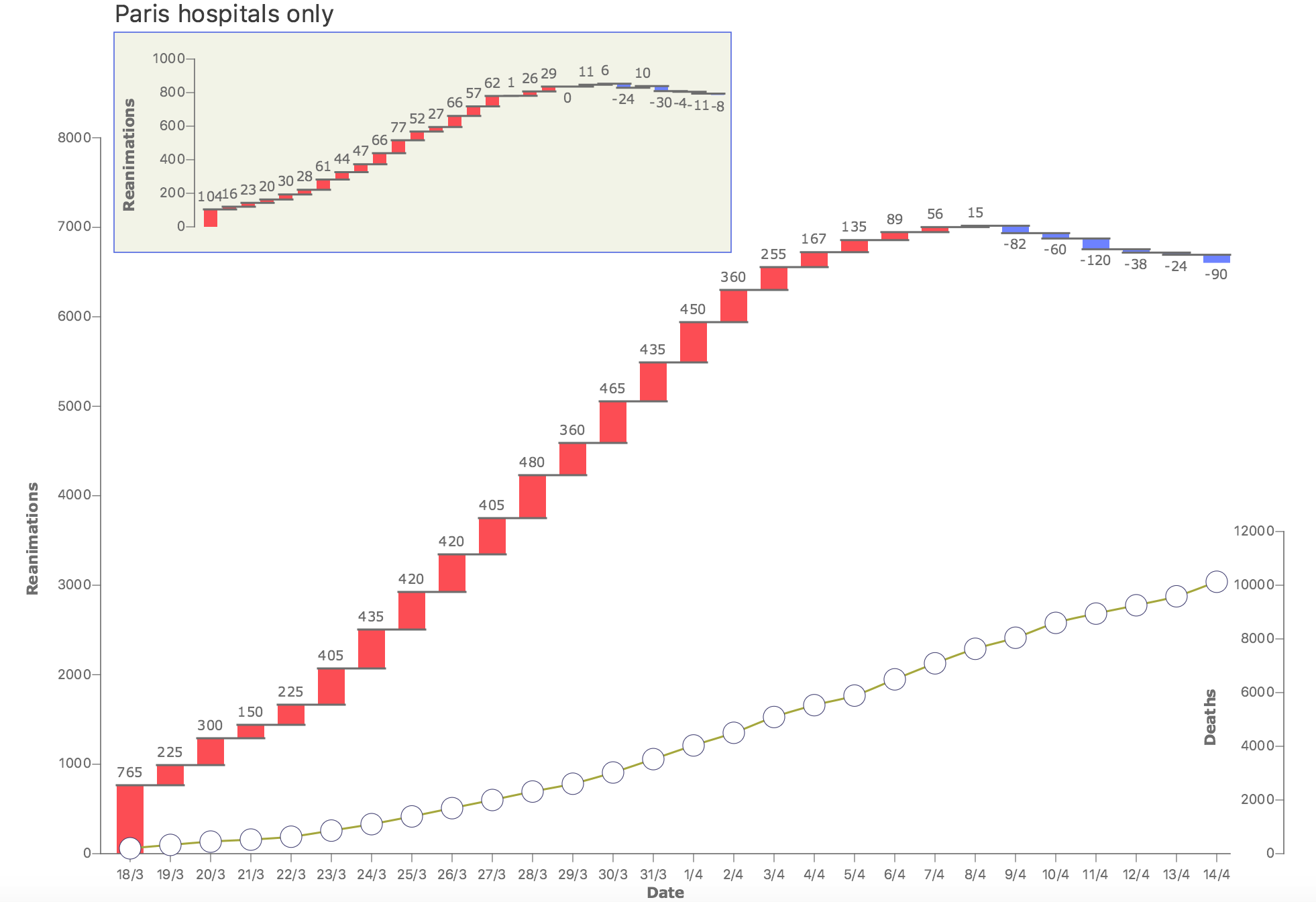
Waterfall Charts [real data]
The evolution of reanimations and deaths in French hospitals due to the COVID-19 epidemic from Mar, 18 to Apr, 14 2020 (source).
Note: Liberation later published a similar visualization with updated data.
![[image]](images/reanimations-covid.png)
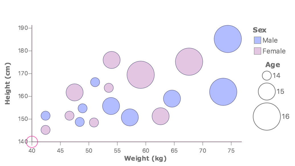
Bubblechart
A bubble chart showing the correlation between height and weight in a group of teenagers.
![[image]](images/bubblechart.png)
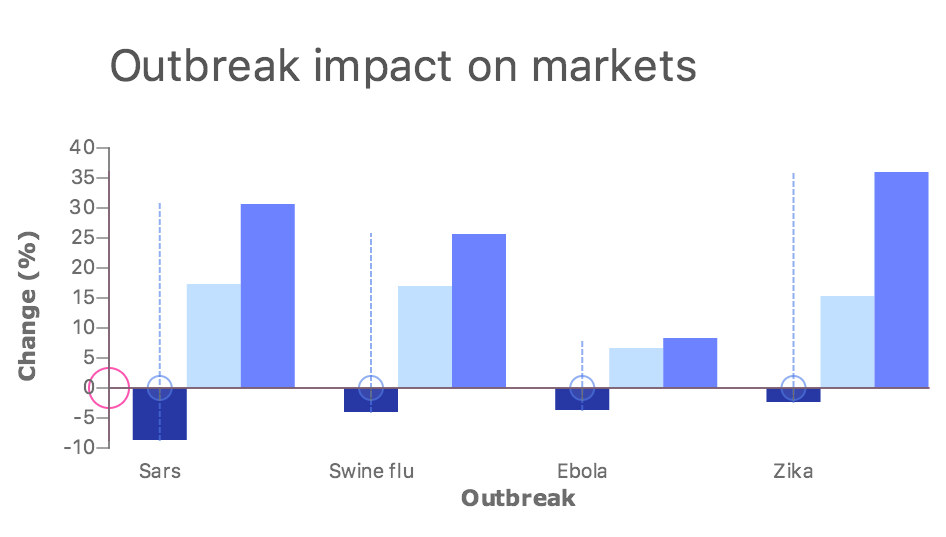
Nested Barchart [approximate data]
A barchart inspired by an article on the Financial Times on the market impact of outbreaks.
![[image]](images/barchart-outbreaks.png)
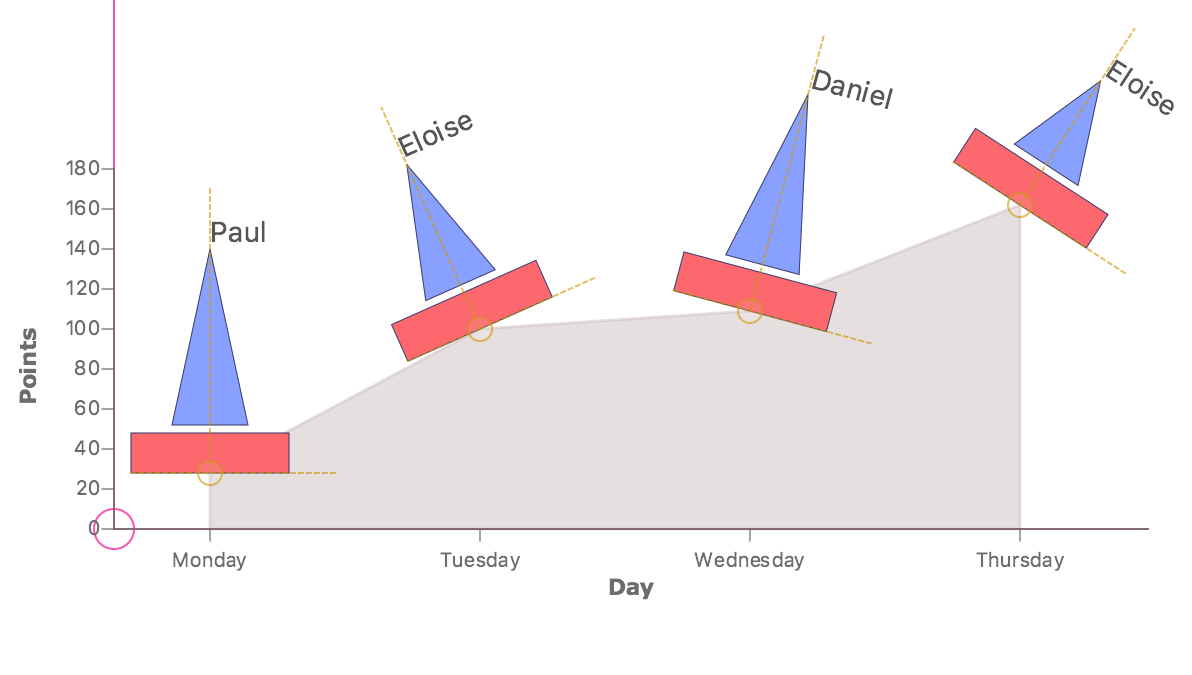
Custom Area Chart
A custom area chart where glyphs take the form of a sailboat.
![[image]](images/custom-areachart.png)
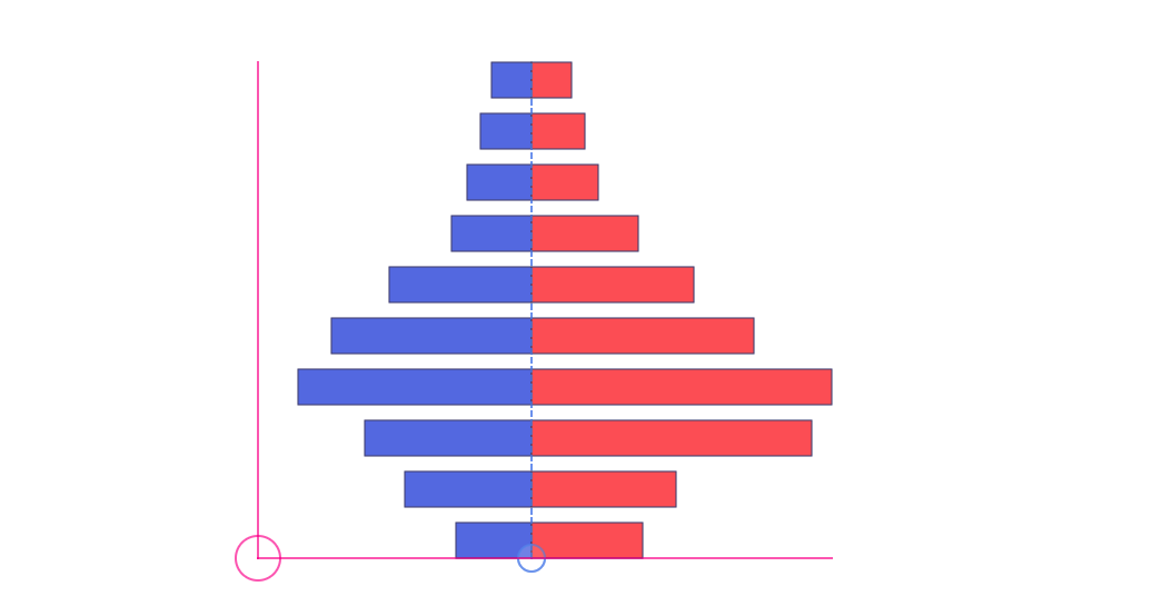
Population Pyramid
Structure of an age-gender pyramid that shows the age distribution of women and men.
![[image]](images/age-pyramid.png)
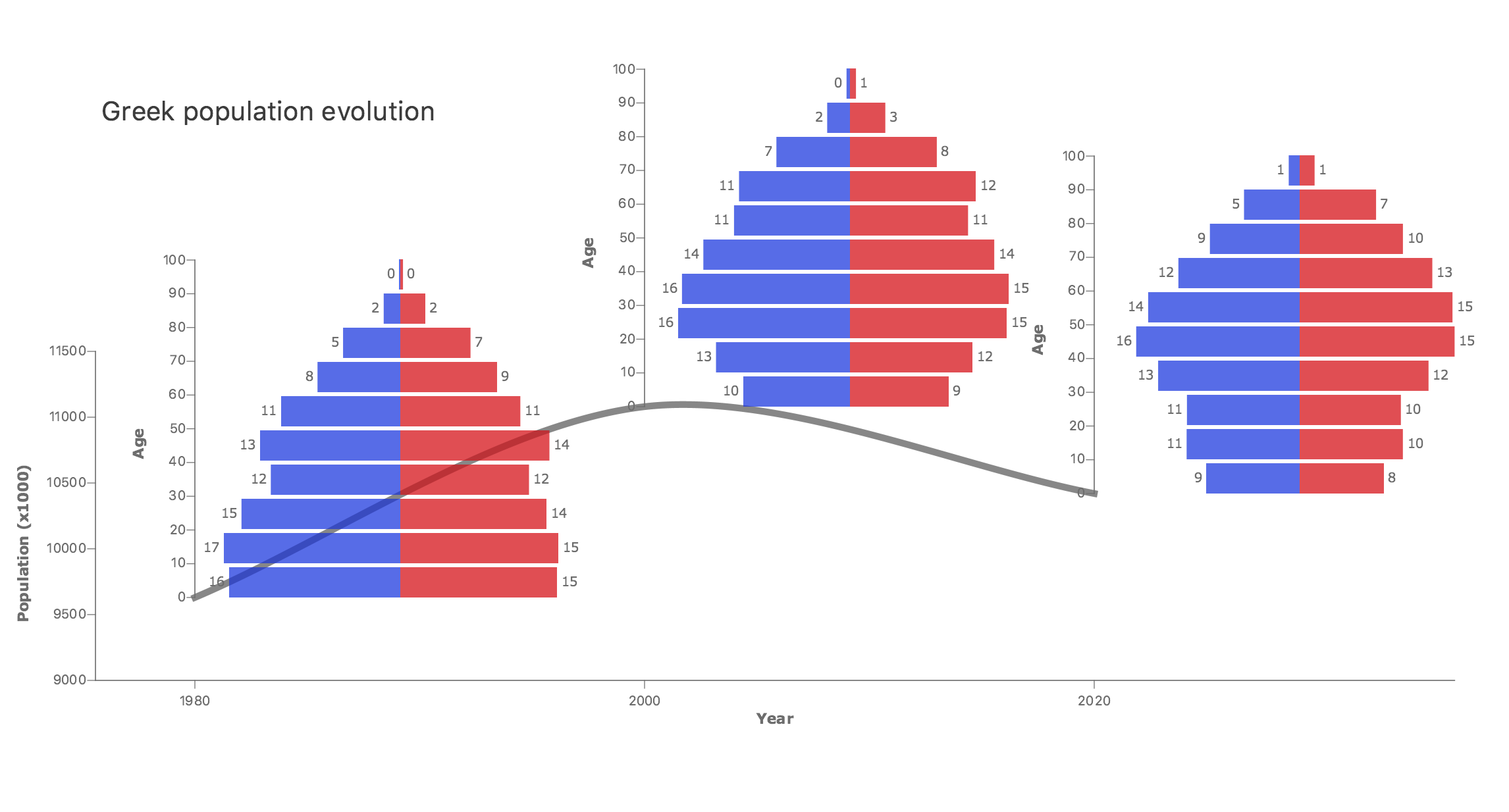
Nested Pyramids [real data]
A custom visualization showing the evolution of the Greek population from 1980 to 2020 (source).
![[image]](images/greece-population.png)
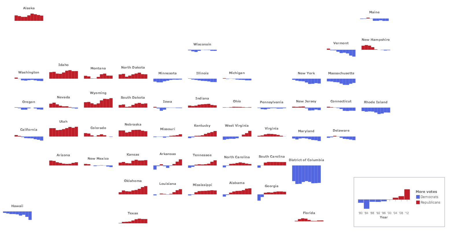
Red and Blue America [real data]
Reproduction of a nested barchart visualization published in the Wall Street Journal article.
![[image]](images/red-blue-america.png)
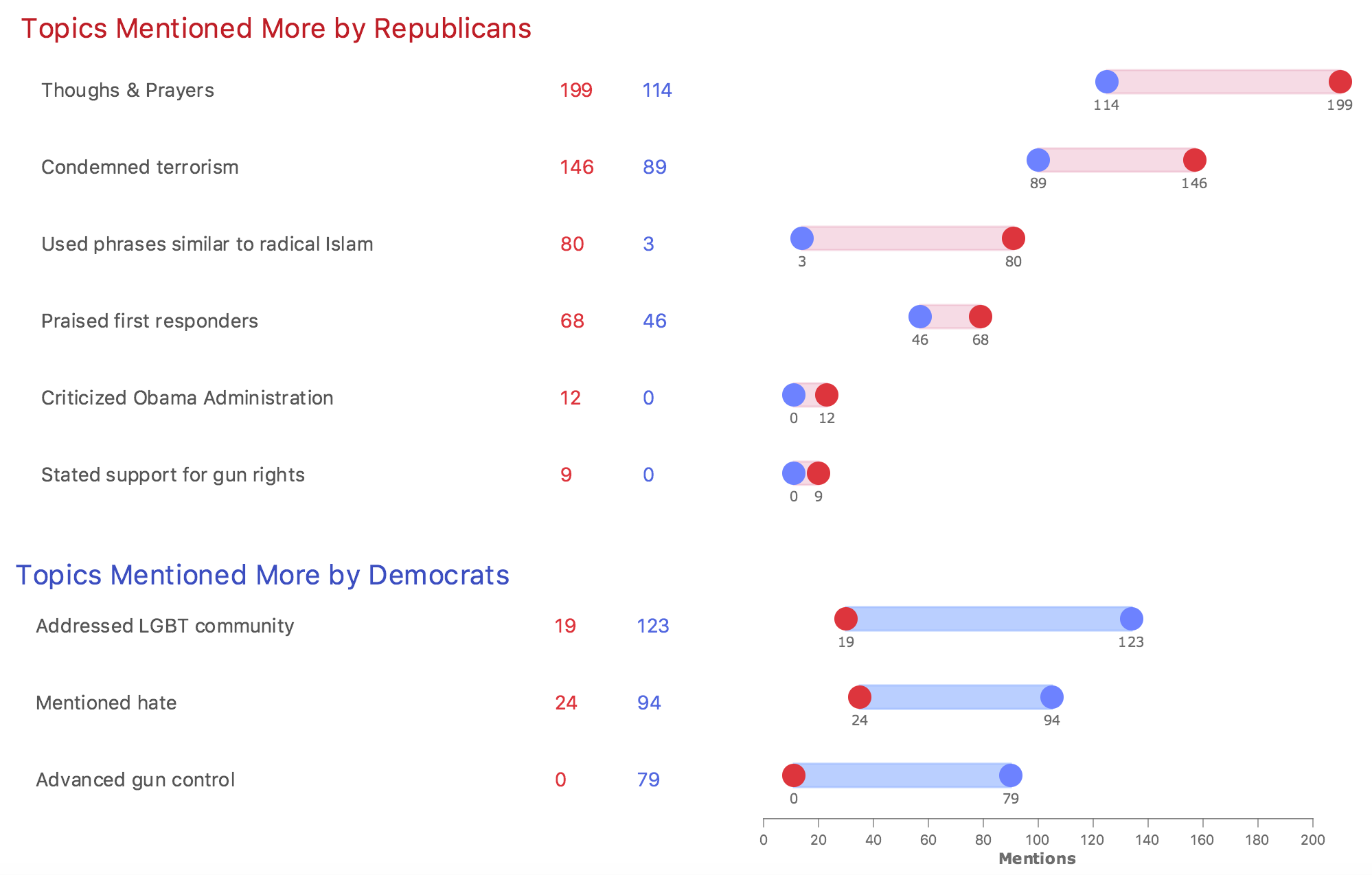
Reactions on Mass Shooting
Topics mentioned by Americans after the Orlando shooting (from Data Illustrator's gallery)
![[image]](images/republicans-democrats.png)
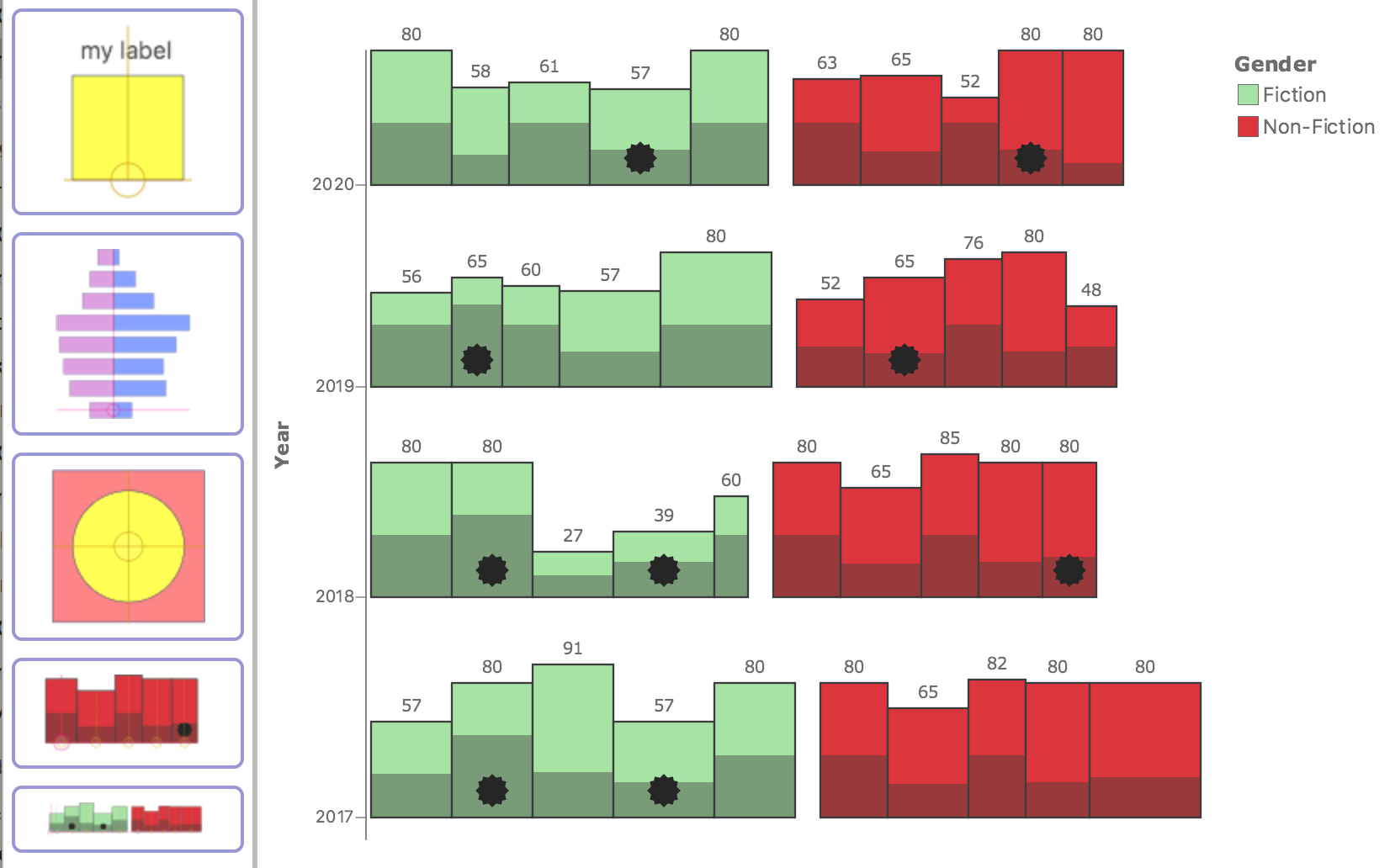
Best Bookshelf
Based on Tany Kim's best bookshelf visualization and Charticulator's version. Our data are not real.
![[image]](images/bookshelf.png)
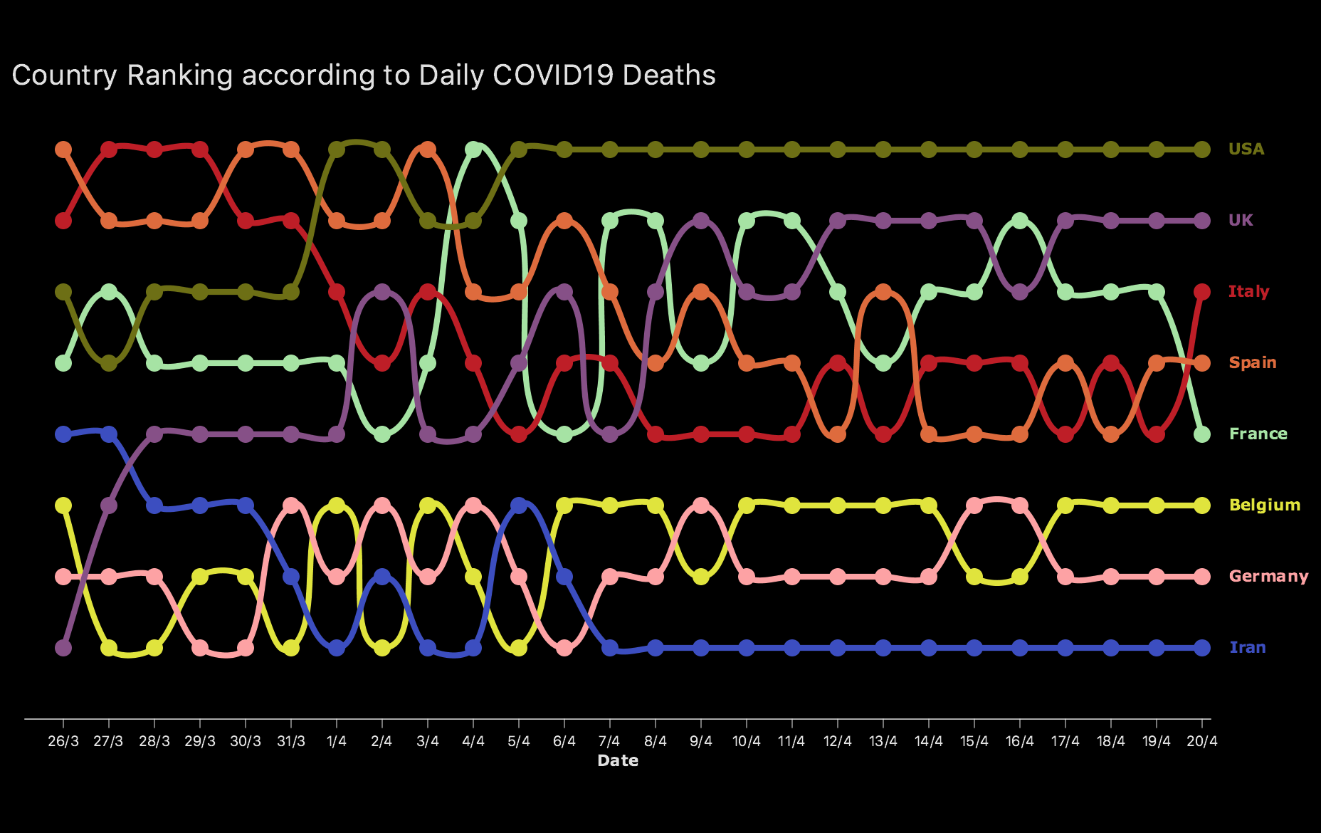
COVID-19 Daily Deaths [real data]
Chart showing evolution of daily deaths in eight countries. We show the ranking of the countries (source).
![[image]](images/covid-deaths.png)
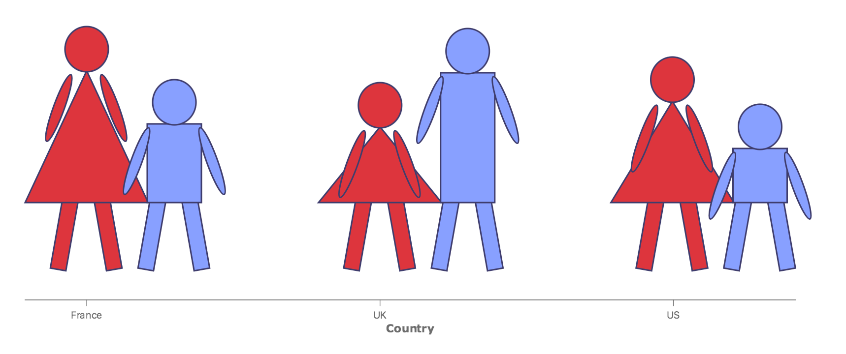
Infographics with complex glyphs
Reusing complex glyphs that represent here simplified figures of men and women.
![[image]](images/people-infographics.png)
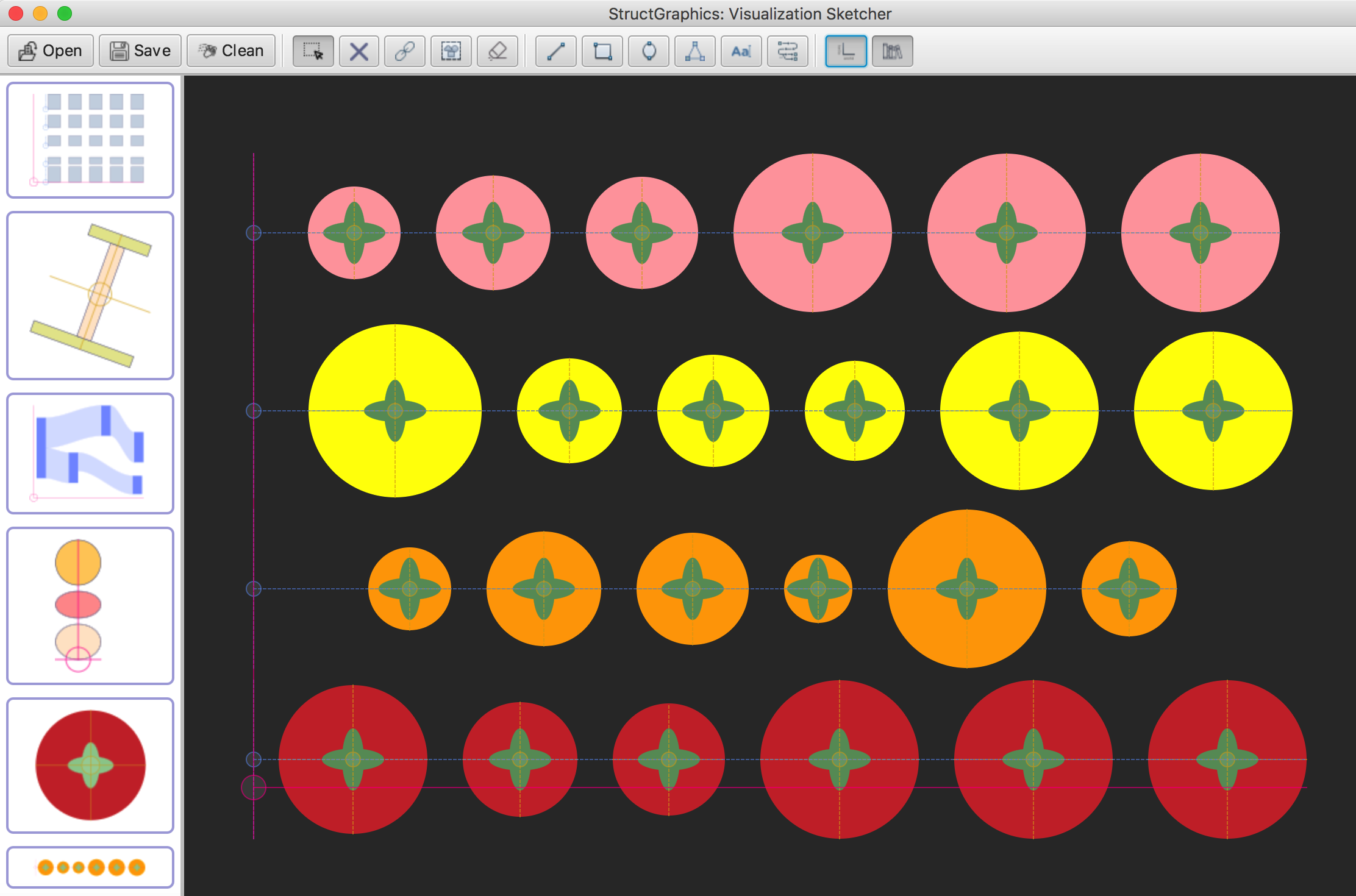
Graphic design
Example that demonstrates how property sharing mechanisms can be used in graphic design.
![[image]](images/tomatos-graphics.png)
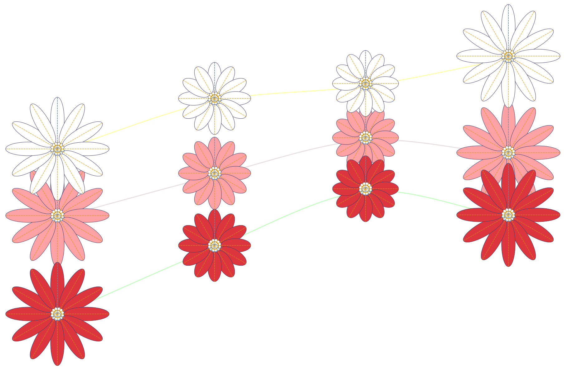
Graphic design No2
Another design example where glyphs take the form of daisies.
![[image]](images/flowers-graphics.png)
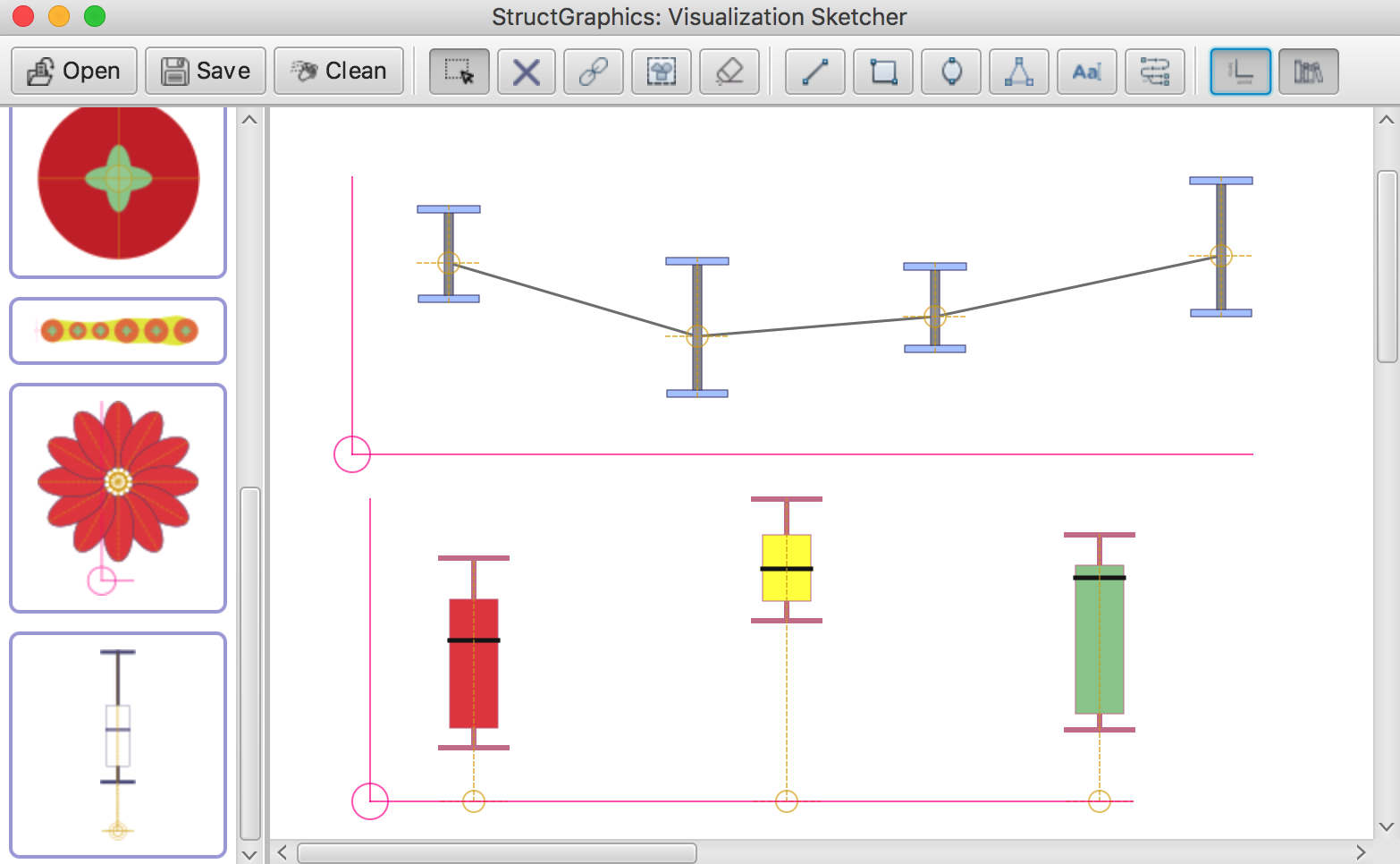
Custom error bars
An example that demonstrates how to design boxplots and reuse custom error bars.
![[image]](images/error-bars.png)
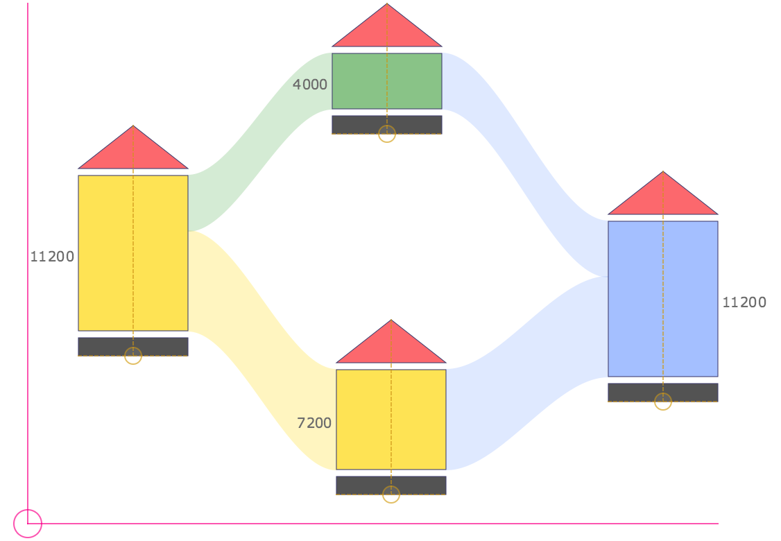
Custom Sankey
A Sankey diagram where the flows connect the internal shapes of groups. The connections represent financial flows between institutions.
![[image]](images/custom-sankey.png)